
Building a Destination design system
UI Lead
Making Ontario an exciting place for locals to explore again.
Building a Destination design system
UI Lead
Making Ontario an exciting place for locals to explore again.
Building a Destination design system
UI Lead
Making Ontario an exciting place for locals to explore again.
Creating something that scales
DO wants to make locals excited about exploring their home again while air travel is limited. This was an opportunity to reposition themselves at the height of the COVID lockdown through a redesign, and optimize the redesign for long-term growth.
What do we currently understand about local tourists?
Home doesn't feel like home: Locals are feeling uncomfortable about traveling due to COVID restrictions, but also are unhappy with the lack of separation from their home vs lifestyle: work, gym, spa, theatre, bar, etc.
Isolation hurts wellbeing: The attitudes towards social distancing is mostly positive, however it is clear social isolation and isolation from outdoor activities are negatively impacting their wellbeing.
Difficulty finding alternatives: With the need to step outside more, locals are struggling to find COVID-safe activities. It is especially difficult with inconsistent and frequently changing policies from business-to-business.

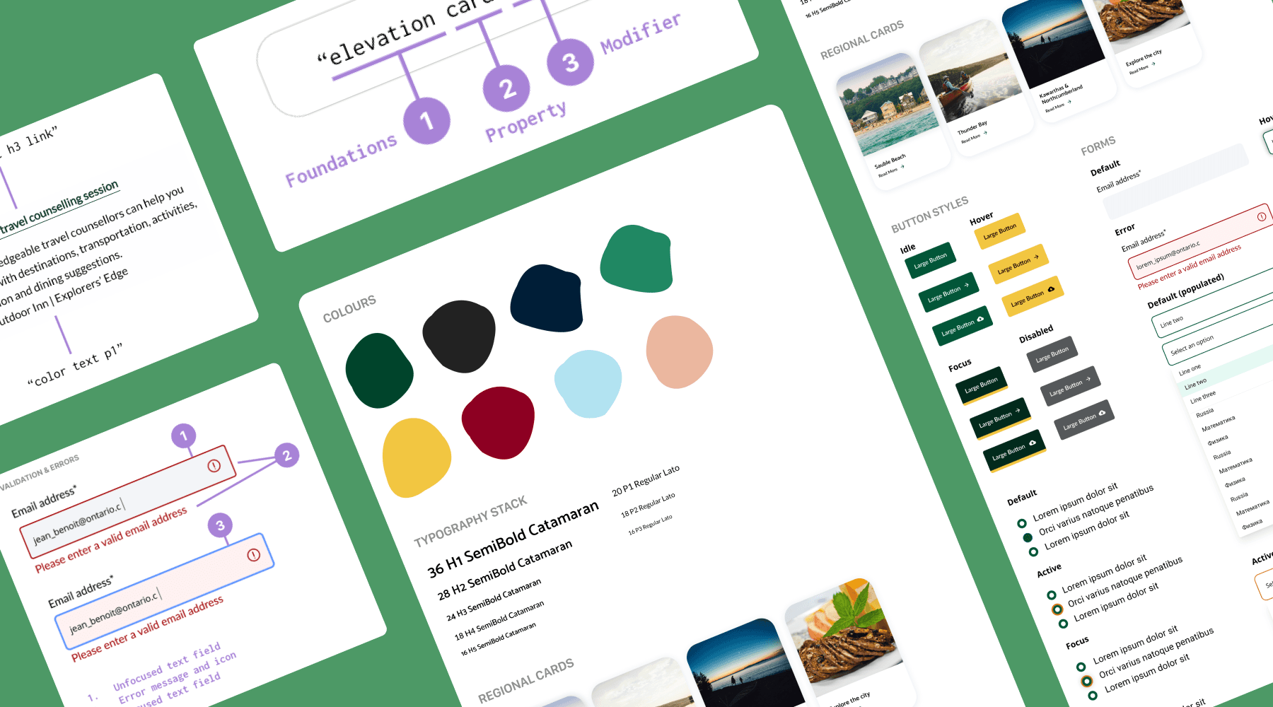
Introducing a new design system will excite Ontario locals about re-discovering their home through a fresh perspective. This will also allow the business to scale with minimal disruptions internally and externally. Our research process includes establishing design principles, looking to other design systems such as Atlassian or Material for guidance, conducting a design audit, language definition, which eventually brought us to foundations, patterns, and components.
Guiding principles
Prioritize accessibility
Easily scalable
Builds confidence
Keep it simple
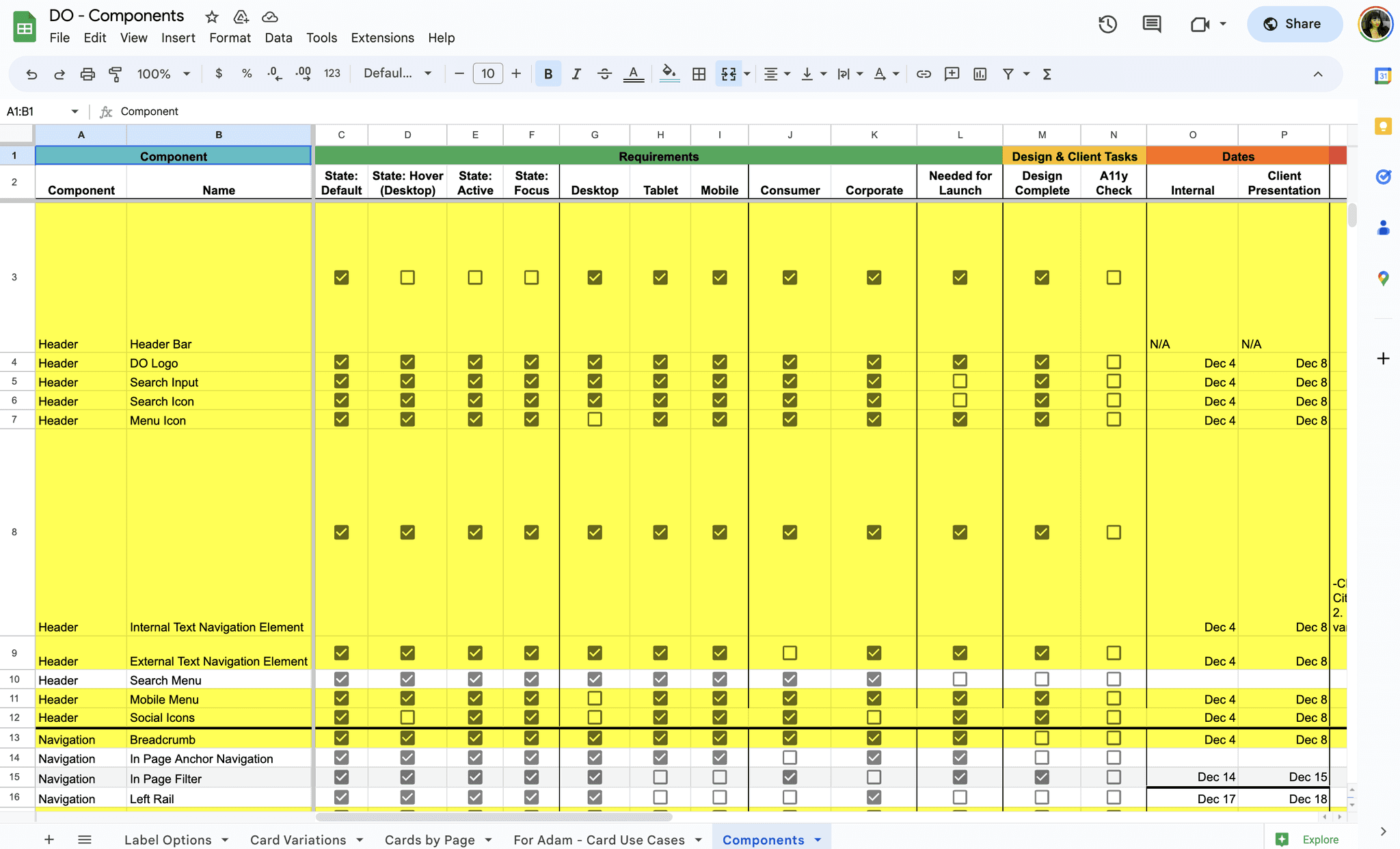
Above: component + states inventory spreadsheet.
Understanding what we're building
The website was full of inconsistent marketing pages, so I worked with UX to gather every component and pattern on the website so we can begin defining our deliverable.
Gathering what we need
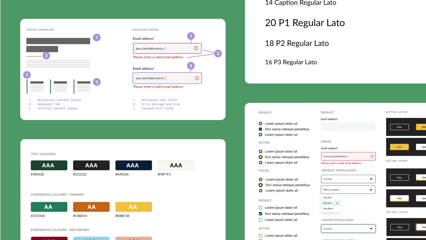
We conducted a design audit which included all front-end elements such as interactions, states, motions, and existing accessibility capabilities. Through this, we identified inconsistencies and patterns which helped shape our requirements.
Multilingual support & flexibility over popularity
There are many reasons to go with either, however based on the site requirements, needs of the engineers, and flexibility, we went with Foundation 6 instead of Bootstrap. Its unfortunate that there is a bigger learning curve and not as much support for Foundation, but having minimal customization because its built on SASS, flex grids, multilingual support, and easy-to-read syntax for non-developers made it an easy choice for our stakeholders.
Bootstrap is great because it has less cross-browser errors and far more documentation, but it is more tedious in customization which meant more room for HTML errors, and the jQuery plugin dependency was unnecessary which would affect performance for a 150+ page site.
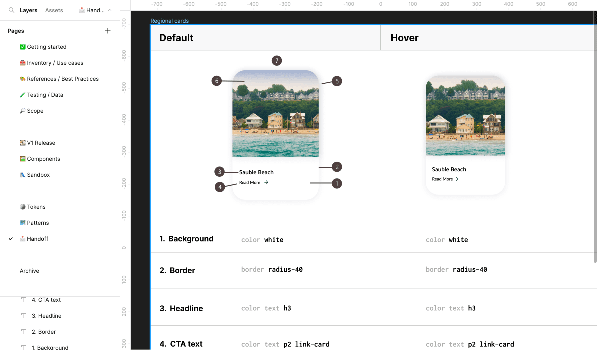
Handoff in the same place as design
The team agreed upon Figma for documentation for several reasons: all our components lived there, it had ample space, every stakeholder had access, and we could easily do web previews.
Above: component + states inventory spreadsheet.
Understanding what we're building
The website was full of inconsistent marketing pages, so I worked with UX to gather every component and pattern on the website so we can begin defining our deliverable.
Gathering what we need
We conducted a design audit which included all front-end elements such as interactions, states, motions, and existing accessibility capabilities. Through this, we identified inconsistencies and patterns which helped shape our requirements.
Multilingual support & flexibility over popularity
There are many reasons to go with either, however based on the site requirements, needs of the engineers, and flexibility, we went with Foundation 6 instead of Bootstrap. Its unfortunate that there is a bigger learning curve and not as much support for Foundation, but having minimal customization because its built on SASS, flex grids, multilingual support, and easy-to-read syntax for non-developers made it an easy choice for our stakeholders.
Bootstrap is great because it has less cross-browser errors and far more documentation, but it is more tedious in customization which meant more room for HTML errors, and the jQuery plugin dependency was unnecessary which would affect performance for a 150+ page site.
Handoff in the same place as design
The team agreed upon Figma for documentation for several reasons: all our components lived there, it had ample space, every stakeholder had access, and we could easily do web previews.
Outcomes
🎖️ Refined design system
New brand colours, typography, icons, patterns, buttons, and more for an eye-catching visual identity.
🤝🏽 Shared quality standard
Developing a single point-of-truth for the visual system on the consumer and corporate side. No more isolated changes; making a single change becomes exponential.
🧱 Smoother collaboration
Unified design and engineering through stack mirroring, along with sharing workload evenly with all stakeholders. Oriented everyone towards a singular growth direction.
📈 Faster time-to-market
Applied across 150+ pages by launch. Encourages higher quality MVPs for scaling, early product validation ensures faster QA time and reduced technical & UX debt. Faster onboarding. Minimizes risk for experimentation.
📉 Reduced learning curve
Accessibility and consistency extends market reach. Reduced learning curve for stakeholders and users because of consistency. More time allocated for high-impact work.
Reflections
Resourcing
Tight on resourcing: production time too short, no E2E testing so heavily relied on existing insights
Big learning curve for people with no system or front-end experience
More engineer involvement: Should’ve involved in kickoffs and once we agreed to design a component or pattern, NOT once we're talking about shipping
Process
Preparing handoff-ready documentation should begin around prototyping stage
Creating 1 Figma file per component so Figma doesn’t slow down (we spend so much time on single components)
Documentation could’ve been more organized; QA & shipping higher priority than documentation
Bureaucracy
Early stages were very challenging as executive stakeholders were married to individual ideas with no rationale
COLLABORATION!! Helps us advocate for our ideas
Involve them in between reviews
Acceptance✨